Snowboard.com branding
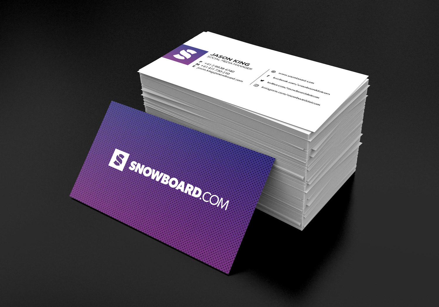
Snowboard.com was a startup I worked for. The owner purchased the domain name snowboard.com hoping to create a hub for everything snowboarding, with the eventual hopes of creating a third party store to sell snowboarding goods.
At the time, a lot of snowboarding companies were veering towards a very grungy style. I wanted ours to stand out by being the opposite clean and simple. And as we were going to have a store I didn't want to alienate anyone with a niche style. Being nearly totally web based, our logo was mostly going to be visible at small sizes. I also wanted to use a common web font so there were no problems on our website when we couldn't use jpgs.
The flowing S represented the lines snowboarders cut when carving down the mountains and although the predominant colours you would think of at the snow would be blue and white, I added purple for flavour.
The grid texture you see in the background is similar to the kind of textures you see on the snowboard laminates.
Work was produced in Adobe Indesign, Illustrator and Photoshop.
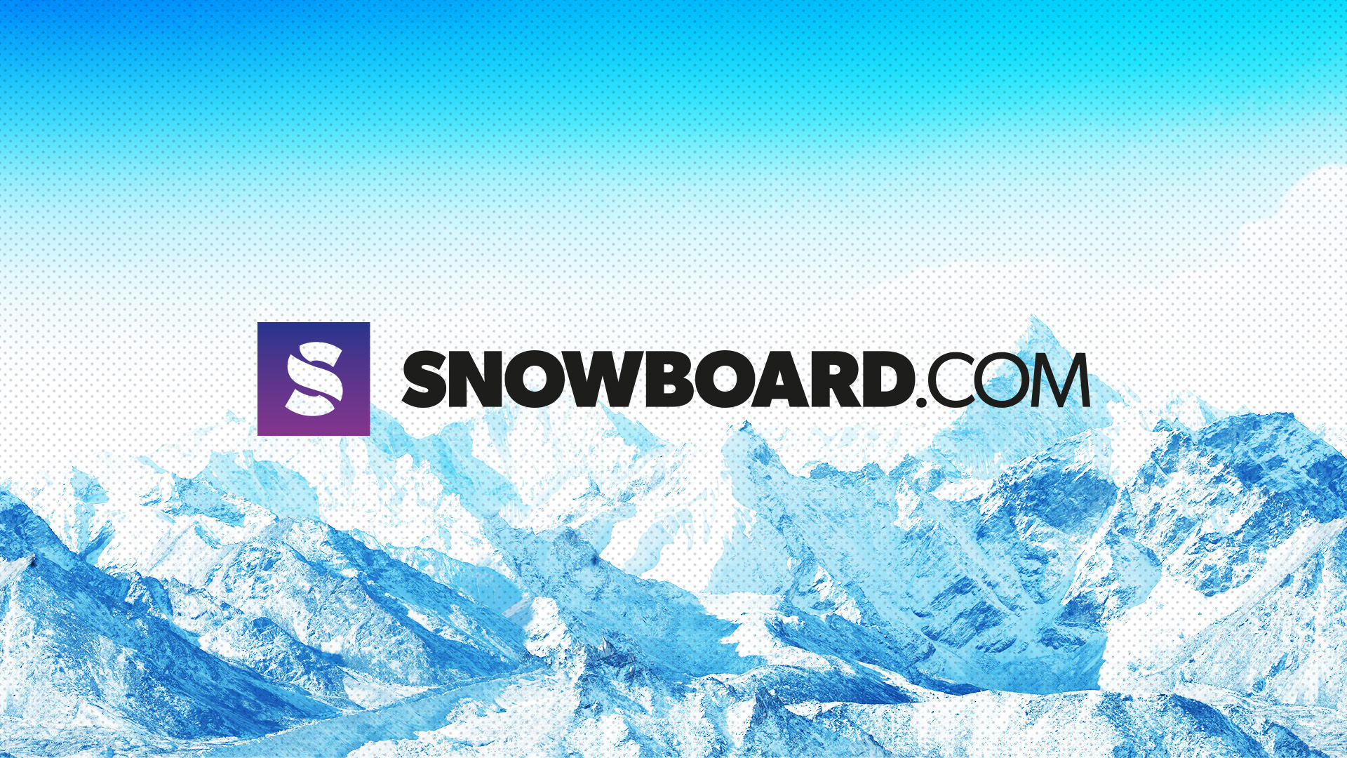